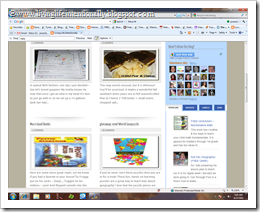
 I have redesigned my blog. There were 2 reasons for doing so: 1) for some reason when you scrolled down on the main page of the old one the text disappeared – annoying, wasn’t it? 2) To make my page more visually appealing & user friendly.
Now revamping my blog for someone who is code illiterate was NO EASY TASK!! I would constantly run into coding issues and ask my hubby for help. Unfortunately for me, my hubby never liked programming & doesn’t remember much of it … bummer! So it was up to me. Although there were moments I wanted to pull my hair out…. and plenty of me pleading with the computer to do what I wanted it to …it got done & I am very proud of of it.
I added a lot of fun bells & whistles (so to speak) and wanted to share them with you! Some of my new favorite features:

- My Blue Navigation bar under the Living Life Intentionally Banner – No this isn’t new! But to get it to work in many templates was next to impossible; it would always hide behind pictures and sliders. But I really like that you can find anything in my site from that banner. If you are looking for a recipe you don’t have to search through all my posts about recipes to find the one you want.
- Slider – This is the large picture box under the navigation bar – It contains 6 pictures that highlight different things on my blog you may not have seen. I love having the pictures, that they change or you can scroll through them, and whether you click on the title or picture it will take you to the highlighted post. Pretty, huh?
- The way the posts appear on the main page – I loved how there is a picture & little blip it on the main page only. This allows you to quickly see more posts and click read more on the ones you like.
- My Subscribe buttons – This may be my favorite feature!!! I found these cute little puzzle buttons. If you put your mouse on top of them they hoover to a different (clearer) image. Try it – it’s fun!!!
- Tabbed Widget – This is in the sidebar, under the Google Friend Connect. It allows me to pack a lot into my sidebar without taking up a lot of room. You can click on any of the blue tabs to have a category appear! I wanted people to be able to see archives or see the labels (like searching for key words in my posts), but they take up a LOT of room. So this was a perfect solution and so easy!
- Grab my button – which I recently added is still there. I love the concept of buttons – so much more fun that looking at a text list, isn’t it?
- Sharing is Caring widget at the bottom of the full post pages – I love these buttons that pop up & allow readers to share the post on their social outlet of choice.
- Link within Widget – This is what shows you three other posts in my blog that might interest you that appears at the bottom of full post pages. It is random & a great way to see some older posts you may have missed.
- Lists of blogs I love – After all, isn’t that how you found this one? There are so many great blogs out there, but how in the world do you find them? Networking! So check out some of my favorites & let me know if you have a favorite I’ve missed!!
Well, there are a few highlights from my new blog. If you are interested in finding out how I got any element, let me know. Like any of my new features?


